Website Design
Fastrack, a sub-brand of Titan Watches, has long been synonymous with vibrant fashion and youthful appeal in the Indian market. However, despite its strong brand presence, the Fastrack website has struggled to translate this identity into an engaging online experience.

01
The Challenge
Designing with Balance and Feasibility
The challenge was in achieving a delicate balance between creativity,practicality & feasibility, ultimately delivering an engaging experience that drives conversion while staying true to Fastrack's brand identity.
Competing with marketplaces
Fastrack products are well-known and widely available in various marketplaces. To increase traction and boost sales, we needed to enhance the user experience, offering something more compelling to our customers.
Harmonizing Priorites
A notable challenge arose from reconciling differing priorities between the e-commerce and brand teams. The e-commerce team sought detailed highlighting of offers and product details, while the brand team preferred a minimalist, fashion-forward approach.
02
A heuristic evaluation of the main user flow of the website, i.e. from the moment of discovery to the checkout process. We understood what the current process was, what had be done, what had be missed and what all can be done to improve the user experience.
The Target Audience of Fastrack is essentially a young audience within the age groups of 18 to 32. So all the research done will be focused on this 3 particular age demographies. We decided to go with 3 methods of data collection, to understand the current trends and the performance of the website
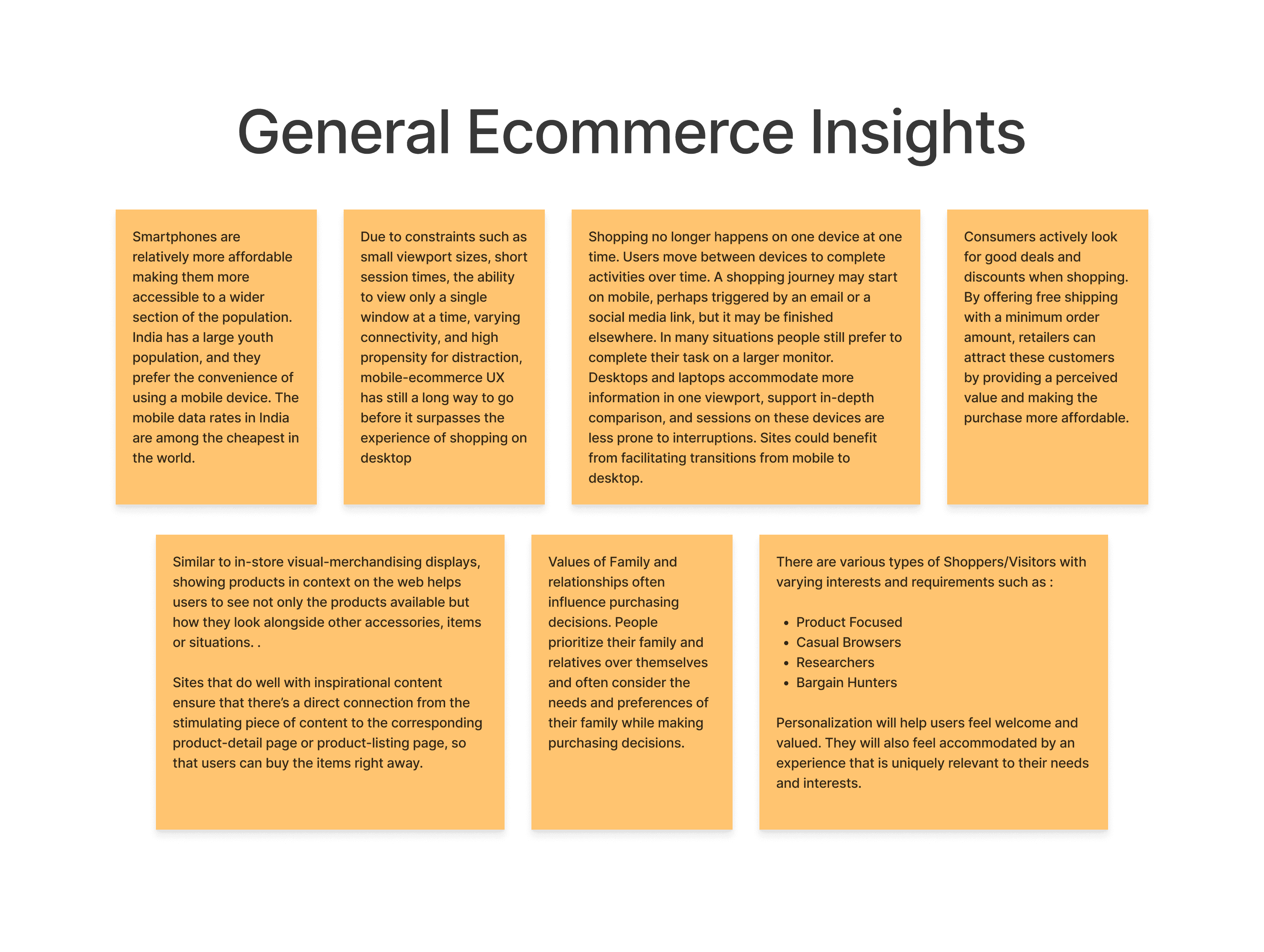
To better understand the problem, the team delved into desk research to comprehend typical user behaviors and UX practices and these were some of our findings:
Indian digital users tend to be more mobile-centric.
Indian consumers are price-sensitive,consumers actively look for good deals and discounts when shopping.
The need to prioritize speed and efficiency throughout the mobile ecommerce experience.
Shoppers often switch between devices, starting on mobile and finishing on desktop for detailed tasks. Sites should facilitate seamless transitions to enhance the user experience.
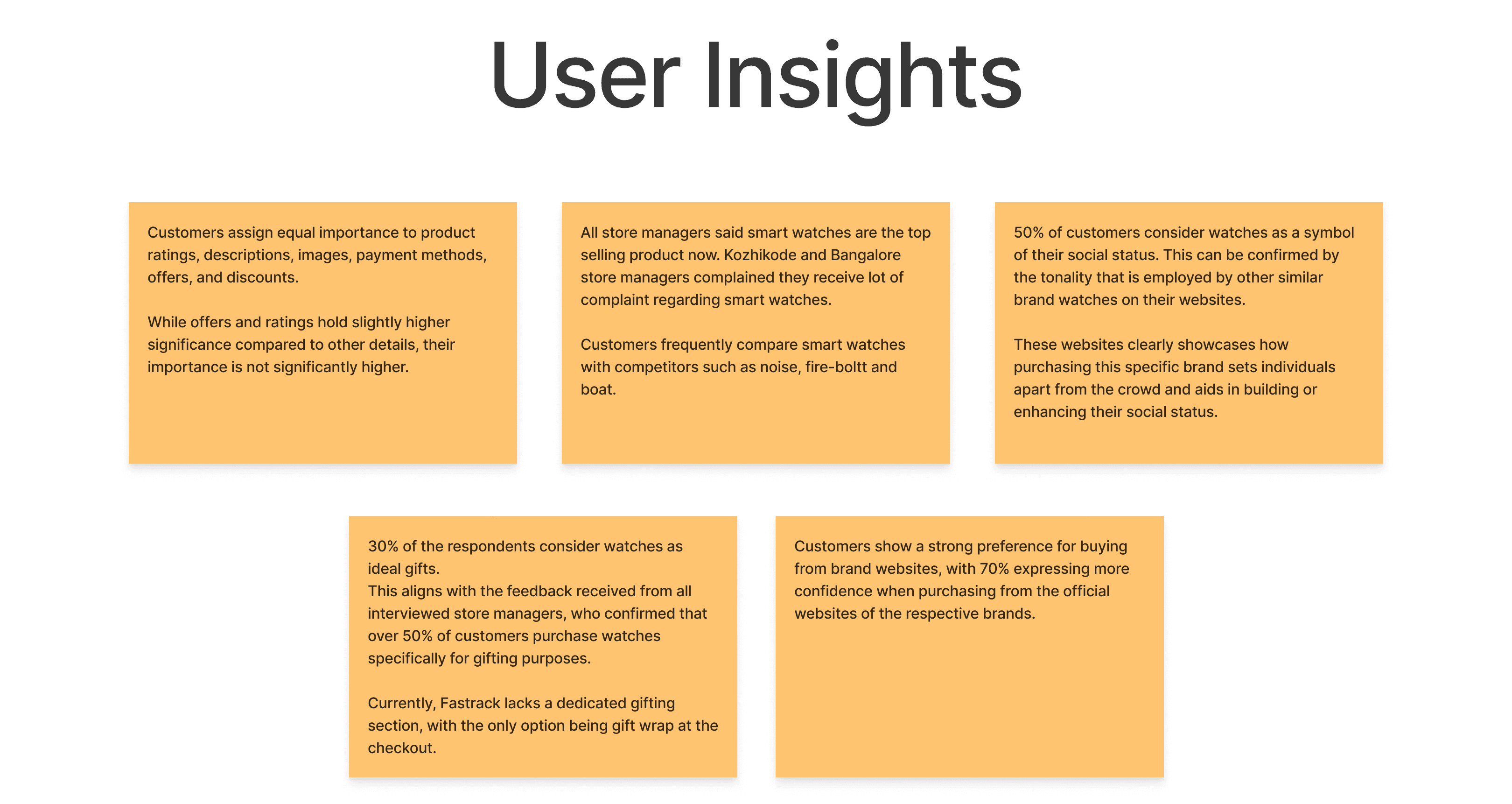
After getting an understanding of general ecommerce practices, we began to delve deeper into insights that were specific to Fastrack's target audience, watch brands, its competitors and benchmarking through 3 data collection methods - surveys, user interviews and Store manager interviews.
These were our insights:
Watches are perceived as Status symbols
Watches are considered as meaningful and ideal gifts
Customers prefer buying from the brand website rather than third-party marketplaces
Equal importance is given to product ratings, descriptions, imagery and payment
Smart watches are the item in demand
03
After a thorough understanding of user and business needs, we identified user personas and revamped the information architecture, addressing issues and ensured a user centric experience. We then finalised the information architecture with the stakeholders, after which we proceeded to the design phase
04
Based on Research findings and analysis of the present website we've formulated a series of enhancements to the Fastrack website experience that aligned with the brand’s values. Through our ideation process, we've identified key strategies to address user confusion, enhance engagement, and better cater to the needs of our young audience.
Making a Robust IA
Simplifying Product information
Giving more context, social proof and an emotional connect
Adjusting the Website Tonality
Gamifying parts of the Experience
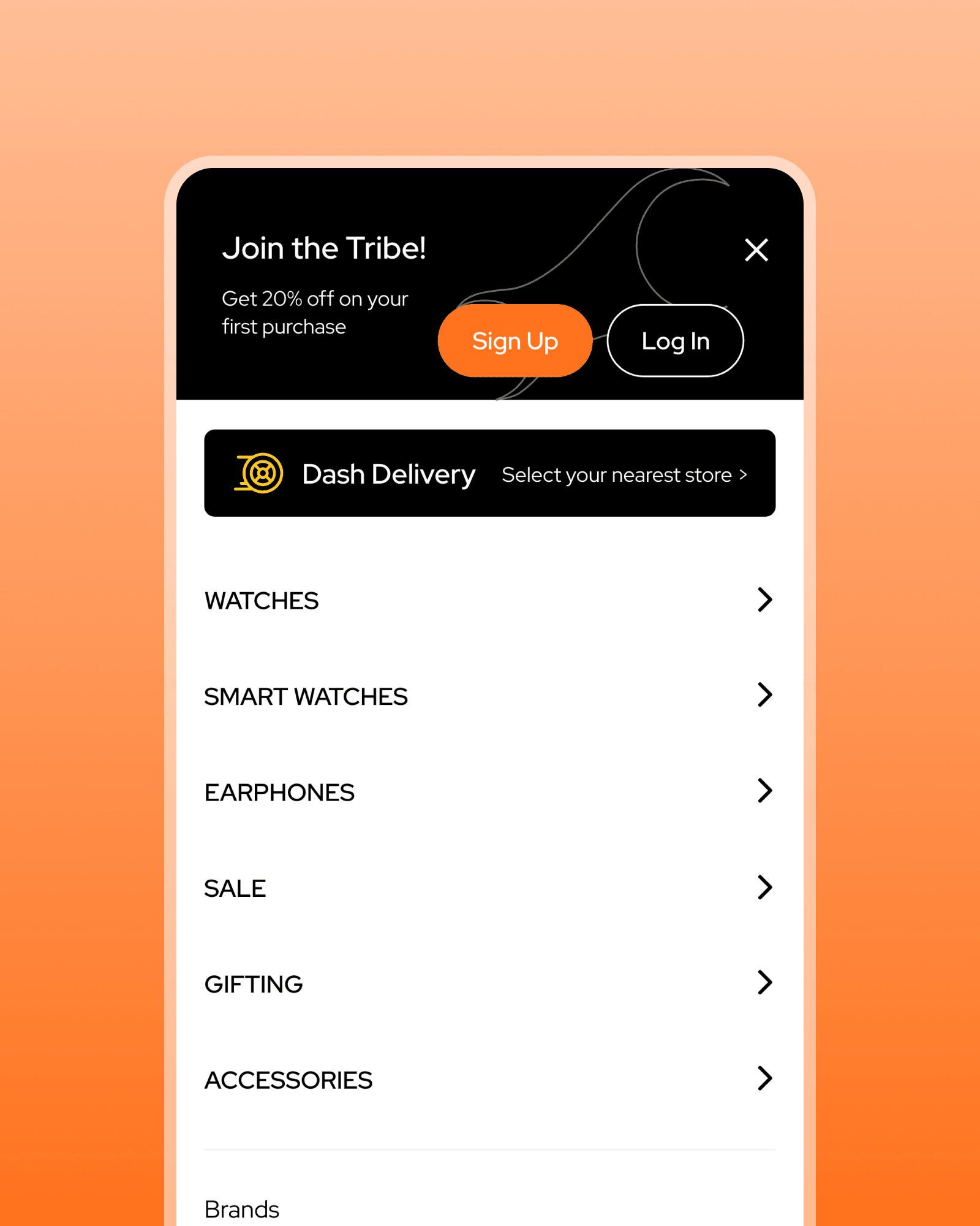
Making a Robust IA
To address the user confusion and improve navigation on the Fastrack website, we have opted for a robust Information Architecture (IA) strategy. This involves implementing clear segmentation of watch categories, ensuring intuitive navigation for users to easily locate their desired products.
Additionally, we recognized the importance of gifting as potential category due to its prevalence in the current usage in Fastrack. We then decided to introduce and highlight this section on the website
This strategic approach not only simplifies navigation but also expands the website's offerings to meet diverse user needs and preferences.

Simplifying Product Information
Initially, Fastrack used a complicated naming convention for their products, which benefited SEO but confused users due to truncation and inconsistency. Each color variation had its own listing, adding redundancy. This issue extended to product detail pages, where the complex naming was suitable for traditional watches but became problematic for smart wearables with varying features.
To address this, we proposed a simpler naming convention, including only necessary information such as the collection and a standout feature (USP). Color variations were visually represented, with detailed information in a table at the end of the page to meet SEO requirements. We also repurposed existing banners from third-party platforms to highlight special features, allowing us to simplify the naming convention without compromising SEO.

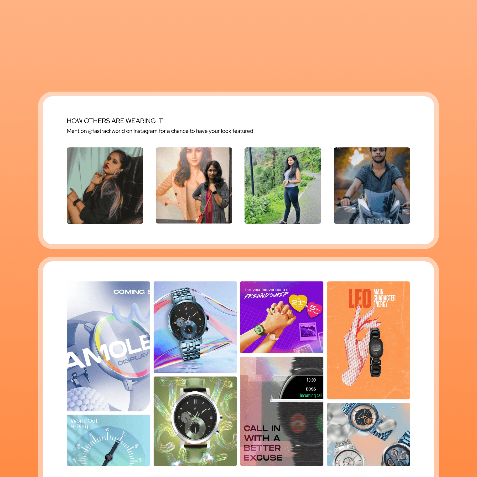
Giving more context,social proof and an emotional connect
In a highly competitive market like fashion, brands that effectively leverage social proof and emotional connections stand out. Humanizing the brand and showcasing authentic experiences creates a unique identity that resonates with the users. Initially, Fastrack only used product images for marketing, missing the opportunity to connect emotionally with their audience.
To address this, we insisted on incorporating lifestyle imagery into the website, prompting a reevaluation of the brand. We introduced a section of curated collections at the top of the product listing pages, offering personalized recommendations based on users' styles and preferences. Additionally, we featured a section displaying user-generated content with customers wearing Fastrack products, humanizing the brand and encouraging users to share their experiences.

Adjusting the Website Tonality
Initially, the website's tone and visual style did not align with its brand values or appeal to the young urban audience. The lackluster design reduced engagement, as users were accustomed to more visually clean and interactive experiences.
The redesign focused on seamlessly integrating the brand's values into the website, creating a clean, minimal, and sophisticated visual experience tailored to our target audience. Every aspect, from layout to color palette, was carefully curated to reflect our identity and engage users effectively. By embracing minimalism, we enhanced clarity and navigation ease. Additionally, we implemented unorthodox flows for features such as Product Comparison and Store Finder, providing unique and engaging experiences that resonate with the tech-savvy and fashion-forward mindset of our audience.


Gamifying parts of the Experience
To enhance the website's interactivity, the Fastrack team suggested integrating gamification into the overall user experience. Our research and analysis of gamification in ecommerce revealed its use in increasing user engagement and brand loyalty.
Our proposals include quizzes, spin-the-wheel activities, and guess-the-price challenges, each offering rewards to incentivize users to explore the brand's offerings. Implementing gamification not only adds an interactive layer but also reinforces the brand's values and perception, fostering a more engaging and memorable user experience.

05
The redesign of the Fastrack website significantly improved user experience, reducing the cart abandonment rate from 91.76% to 72.53% and increasing PDP visits from 30.67% to 57.4%.
We created a clean, robust, and interactive experience that resonates with the target audience while aligning with the brand's goals and business objectives. The Fastrack team has begun testing, and the long-term impact of our designs will be revealed over time.
